Met lijm hoeft het niet voorbij te zijn
Een pagina komt los van je paperback, pocket of hardcover. Misschien is een heel pak pagina’s losgekomen van de gelijmde rug. Misschien is er een flinke breuk ontstaan in de lijmverbinding, en lijkt het erop dat losse pagina’s ieder moment kunnen gebeuren. Wat moet je doen? Het boek is verder in een redelijke staat, en je bent zeker niet van plan om het geld uit te geven om het te vervangen. Je kunt je pagina’s zachtjes terugstoppen, het boek dichtdoen, en wegsluipen in een poging om het dilemma te vermijden…
Of je leest dit artikel om erachter te komen hoe je een boek repareert met lijm, en wordt meteen weer vrolijk! De materialen die je nodig hebt zijn allemaal redelijk simpele spullen, die je misschien al hebt. Maar wees gerust, ook al moet je alles nog kopen, het project hoeft niet meer dan €8 te kosten, en je houdt genoeg materiaal over om honderden lijmgebonden hardcovers of paperbacks te fiksen met de spullen die je overhoudt.
Dingen die je moet verzamelen voor je begint
- Zuurvrije polyvinylacetaatlijm (van die witte handwerklijm)
- Een fijne verfpenseel
- Een kleine kop of een bakje voor water
- Een beetje warm water
- Papieren doekjes of servetjes
- Een scherp mes, liniaal of vergelijkbaar rechtlijnig gereedschap
- Waspapier
- Goed licht
- Een aantal stevige elastiekjes
Bereid je spullen voor
Verspreid een paar papieren doekjes, karton, of kranten over het oppervlak waar je op werkt om rotzooi te voorkomen. Leg een paar papieren doekjes opzij om lijmvlekken op te ruimen, mocht dat nodig zijn. Vul de beker of kom met warm water, en zet hem binnen handbereik. Zorg dat de penseel schoon is, en zet hem naast het water. Je lijmfles en elastiekjes horen ook in de buurt te zijn.
Je kunt ook kiezen om geen penseel te gebruiken. In dat geval zul je absoluut wat waspapieren strips en een recht gereedschap zoals een liniaal in de buurt moeten hebben. Het is het best om je waspapieren strips van tevoren voor te bereiden. De hoogte van de strips is irrelevant, zolang ze even lang of langer zijn dan het boek. De breedte moet zo’n 10 cm zijn, maar je hoeft niet heel precies te doen. Vouw je waspapieren strips in de lengte door de helft, zorg voor een stevige vouw, en zet ze aan de kant. Voor iedere losse pagina in je boek heb je twee strips nodig. Je gebruikt ze misschien niet allemaal, maar een goede voorbereiding is belangrijk om alles goed te laten verlopen.
Bekijk je boek zorgvuldig
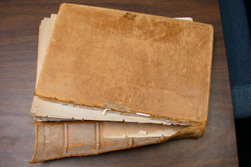
Ieder boek moet net iets anders worden gerepareerd, en moet dus zorgvuldig worden bekeken voordat je iets doet. Een boek is niet alleen een verzameling onderdelen – pagina’s, bladen, ruggen, enz. Een boek is een systeem. Als je twee pagina’s samenlijmt op een zwaktepunt, zonder te overwegen welke spanningen het boek moet overleven, zul je al snel ontdekken dat je ene reparatiebeurt verandert in een hele serie reparaties. Hoe vaker je een boek repareert, hoe duidelijker je reparaties zichtbaar zullen zijn.
Leg niet alleen de breuken of meest duidelijke problemen vast, maar ook alle mogelijke zwaktepunten. Als er delen van je boek zijn die moeten worden gerepareerd met meer dan alleen lijm, denk dan goed na over de volgorde waarin je je reparaties uitvoert voordat je de lijmfles oppakt! Normaal gesproken is het het best om te beginnen met alle eventuele lijmreparaties, maar je wilt er zeker van zijn dat je doorgaat op een logische en efficiënte manier, zodat je een zo strak mogelijk resultaat krijgt. Zorg dat je zo goed mogelijk bent voorbereid voor je begint met een meervoudige reparatie!
Scenario 1 – Eén losse pagina
Als één pagina uit je boek is gevallen en de binding zit goed vast, dat is het een makkelijke reparatie. (De binding zit goed vast als er geen barsten of lijmproblemen zitten rond de plek waar de pagina zat.) Leg het boek open en plat op de goede pagina. Blijft het boek niet makkelijk open, probeer dan de twee kanten neer te drukken met wat je ook bij de hand hebt. Je zult allebei je handen nodig hebben voor de reparatie!
Doe de opening van de lijmfles half open, zodat je de lijmstroom beter kunt beheersen. Leg kleine druppeltjes lijm in een streep langs de buitenkant van de vouw van de losse pagina. Breng niet zoveel aan dat het stroomt, of eraf druppelt. Je hebt echt maar heel weinig nodig! Leg vervolgens de gelijmde zijde naar beneden, en breng de pagina zorgvuldig aan terwijl je de boven- en onderrand vasthoudt. Je hebt een paar seconden om de pagina op en neer te bewegen om hem perfect uit te lijnen. Zorg ook dat je hem zover mogelijk naar de rug van het boek schuift. Als je dit correct doet is het een compleet onzichtbare reparatie! Sluit het boek en verschuif de rug zodat hij niet schuin zit. Gebruik elastiekjes om de positie vast te zetten zodra je er tevreden mee bent. Laat het 24 tot 48 uur zitten voordat je het boek weer opent.

Scenario 2 – Een barst in de lijmbinding met losse pagina’s
Bekijk de pagina’s rondom de breuk. Je wilt verschillende pagina’s lijmen voor en achter de breuk, waar ze bij de rug komen. Dit is een voorkomende maatregel die je treft om het boek op de lange termijn te versterken. Als je de breuk lijmt zonder de daarnaast liggende rugpunten te versterken kan dat zorgen voor verdere, steeds lelijkere breuken in de buurt. Het aantal rugpunten dat je verlijmt zal verschillen van reparatie tot reparatie. Twee factors bepalen hoeveel pagina’s je het best kunt verstevigen. De eerste is de dikte van het boek, de tweede is de afstand tussen de breuk en het verticale midden van de rug. Verstevig altijd symmetrisch – breng je drie pagina’s aan de voorkant aan, lijm er dan ook drie achter de breuk. Lijken de pagina’s rondom de splitsing stevig, versterk dan minder pagina’s. Lijken ze minder stevig, versterk dan zoveel als je nodig hebt.
Lijm eerst de versterkende pagina’s vast, en maak het werk af door de daadwerkelijke breuklijn te verlijmen. Gebruik je penseel of de half geopende lijmfles om de lijm licht op de eerste voeg aan te brengen. Een klein beetje is meer dan genoeg! Met een penseel kun je het gelijkmatig aanbrengen, zodat je geen waspapier nodig hebt. Als je gewoon de fles gebruikt, maak het dan af door een stukje waspapier licht over de lijm in de voeg te duwen. Op deze manier voorkom je dat uitlopende lijm de pagina’s over de tekst aan elkaar plakt. (Argh! Onleesbare tekst is altijd lastiger te repareren dan een gebarsten binding!) Sla om naar de volgende pagina, en verspreid de lijm met een recht instrument voor een gelijkmatig en vlak gedroogd oppervlak. Breng vervolgens op dezelfde manier lijm aan in de breuk zelf, en doe het boek zorgvuldig dicht – op zo’n manier dat het droogvolume goed zit. Zet het boek tot slot vast met elastiekjes, en laat het minstens 48 uur lang drogen. Overweeg ook om een paar zware boeken of platte zware voorwerpen bovenop te zetten terwijl het droogt. Let op dat je de rug niet laat draaien terwijl het rust!
Scenario 3 – Verschillende (half)losse pagina’s
Open het boek, en laat het plat liggen op het probleempunt. Leg iets op beide zijdes als het boek niet zelf plat blijft liggen. Volg de aanwijzingen hierboven (Scenario 2) om de pagina’s aan beide zijdes van een breuk te versterken. Behandel de losse pagina’s als laatste. Als het aankomt op het repareren van halflosse, bedenk dan dat het makkelijker is om een compleet losse pagina netjes te lijmen dan een halflosse.
Zijn er halflosse pagina’s, werk ze dan zachtjes uit de binding voordat je ze weer vastlijmt!
Gebruik je penseel of de half geopende lijmfles om een lijmstreep te druppelen langs de rugverbinding van de pagina achter de losse. Plaats je eerste losse pagina erg rustig, en vlak het uit met een recht instrument zodra hij op zijn plek zit. Als er lijm uitloopt van de zijkanten van de pagina’s, maak het dan snel schoon met een vochtig papieren doekje, en waaier de pagina’s zo ver mogelijk uit. Druppel vervolgens een heel klein beetje lijm langs de rugzijde van de droge kant van de pagina. Herhaal dit proces als de volgende pagina ook los is. Heb je eenmaal een pagina bereikt die strak in de binding zit, lijn dan zorgvuldig de randen van het boek uit en sluit het boek. Zet de rug weer recht als dat nodig is.
Het verlijmen van meerdere pagina’s kort achter elkaar kan een beetje vervorming veroorzaken op die pagina’s. Dit is vooral het geval als je de penseel te nat houdt, of als je teveel lijm hebt aangebracht. Het gebeurt! Om dit zoveel mogelijk te voorkomen kun je het boek, zodra het met elastiekjes vast zit, zwaar en gelijkmatig belasten. Laat de bond een dag of twee zitten voordat je je werk bekijkt.
Scenario 4 – Een los segment pagina’s
Bekijk eerst het segment goed om zeker te weten dat de pagina’s niet los zijn. (Dan heb je eigenlijk te maken met een dubbele split.) Als er losse pagina’s zijn, repareer die dan met het advies in scenario 3, maar behandel de losse sectie als een eigen project tot de lijm vastzit. Deze extra maatregel helpt om vervorming te voorkomen.
Ben je eenmaal zeker dat de sectie zelf stevig vastzit, houd dan de achterkant omhoog, en druppel een gemiddelde hoeveelheid lijm over de lengte. Zet vervolgens de verlijmde rand in het midden van zijn voormalige plek in het boek. Lijn de pagina’s in dit segment zorgvuldig verticaal uit, zodat ze niet boven de rest van het boek uitsteken. Lijm verder niets tot dit is gedroogd. Zorg dat de rug vlak is, en niet schuin. Zet het boek stevig vast met elastiekjes, en laat het liggen op de rug – of, in het geval van een ronde rug, op de buitenrand met de rug omhoog. Laat het boek stevig ingeklemd liggen, tussen twee boekenhouders of met een aantal boeken verticaal opgestapeld.
Doe het boek na 24 tot 48 uur open, en behandel beide zijdes van het net gelijmde deel als een losse breuk als er duidelijke breuken in de binding zijn. Soms verschijnt er een beetje lijm aan een van beide kanten, en is er geen verdere reparatie nodig. Is dat echter wel het geval, volg dan gewoon de instructies van scenario 2 of 5, afhankelijk van de manier waarop de breuken moeten worden gerepareerd.
Scenario 5 – Een gedeeltelijk breuk in de lijmbinding
Een gedeeltelijke breuk in de lijmbinding van je boek ontstaat meestal per ongeluk door het lezen. Dikke paperbacks lopen hier het meest tegenaan. De pagina’s zitten niet duidelijk los of gescheiden, maar de binding voelt kapot aan en de oorspronkelijke lijm is makkelijk te zien. Het boek valt niet precies uit elkaar, maar als je het niet nu repareert zou dat snel kunnen gebeuren. Het zou zelfs door een externe papieren binding heen kunnen scheuren, waarna je een compleet gespleten boek overhoudt!
Om dit te repareren begin je door een lichte streep lijm zo dicht mogelijk bij de rug of voeg aan te brengen. Gebruik de penseel voor extra precisie als je dat wilt. Zo niet, stop dan een gevouwen stukje waspapier in de breuk, en bedek de breuklijn zachtjes. Doe het boek vervolgens zorgvuldig dicht, terwijl je zorgt dat alle randen goed zijn uitgelijnd en de rug vlak blijft. Gebruik elastiekjes om het boek vast te zetten terwijl het droogt. (Is het eenmaal droog, overweeg dan om de buitenkant van de rug over te tapen met doorzichtige plakband als je boek een paperback is.)
Het kan nodig zijn om een pagina aan weerszijden van de breuk te versterken voordat je de gedeeltelijke breuk verlijmt. Het is bijvoorbeeld een goed idee om dat doen met boeken waarvan de rug meer dan 3,5cm breed is. Versterk de breuk in ieder geval als de gedeeltelijke breuk optreedt in de buurt van het boek, hoe dik het ook is!
In conclusie…
Het verzorgen en repareren van je eigen boeken hoeft niet lastig, duur of omslachtig te zijn. Doe rustig aan, en denk voordat je iets doet. Wees goed voorbereid door alle spullen bij de hand te hebben voordat je een project begint. En vergeet niet dat je, als je ooit een boek niet durft te repareren, altijd online professionele restaurateurs kunt vinden die een goede reparatie kunnen garanderen. Heb je nog meer advies nodig, twijfel dan niet om je plaatselijke bibliotheek te bezoeken en naar iemand te vragen die voor hen het reparatiewerk doet – voor een nieuw perspectief of een demonstratie.